Name that graph
Being a fan of “name that graph” blog items in Blue Obelisk blogs, I thought this one would make a nice instance.
Categorised as: Publishing, Scientific Culture
Being a fan of “name that graph” blog items in Blue Obelisk blogs, I thought this one would make a nice instance.
Categorised as: Publishing, Scientific Culture
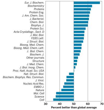
So, Science is 37%, PNAS 50%, and Proteins 63% better. What is used as ranking method?
Hmmm, not easy. This must have something to do with Open Science based on the category.
Something that puts PNAS at the global average, Eur. J. Biochem. way above it, and Cell Way below. It clearly has nothing to do with reputation or quality.
I’m going to guess it’s a graph of the cost of production – either per issue or per article.
Thanks, guys, for joining the game. Rich, sorry, the category was misleading :-).
I’ll tag the thing with a new one.